July 2, 2026
Paint color does more than cover walls. It shapes the way a room feels, influences how people behave, and can even change how large, cozy, bright, or peaceful a space seems. Homeowners often choose colors based on style or resale value, but psychology plays an equally important role. A soft blue bedroom may feel restful after a long day, while a bold red dining room can create warmth, energy, and conversation. The colors surrounding you become part of your daily environment, which means they can affect your mood in subtle but meaningful ways.
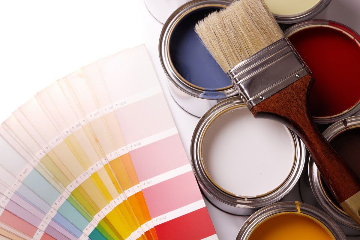
Understanding color psychology can help you make more confident choices before beginning a painting project. While every person responds to color a little differently, certain shades tend to create common emotional impressions. Lighting, room size, flooring, and personal associations all influence the final effect. This is why painting services can be valuable when selecting colors that support each room’s purpose. With the right approach, paint can help your home feel calmer, brighter, and better suited to your lifestyle.
Choosing Colors That Create Calm
Calming colors are often connected to nature, quiet spaces, and lower visual intensity. Soft blues, muted greens, warm grays, and gentle neutrals can help create a sense of balance. These colors are common in bedrooms, bathrooms, reading rooms, and other areas where relaxation matters. Blue often suggests water and sky, which can make a room feel open and peaceful. Green can bring a restorative feeling because it is associated with plants, gardens, and natural growth.
However, not every blue or green automatically feels soothing. A bright turquoise may feel playful, while a deep forest green may feel dramatic and cozy. Undertone matters as much as color family. Cool undertones can feel crisp and quiet, while warmer undertones may feel more comforting. When homeowners use painting services, they can compare samples under different lighting conditions to make sure a color still feels calm in the morning, afternoon, and evening.
Choosing Colors That Create Energy
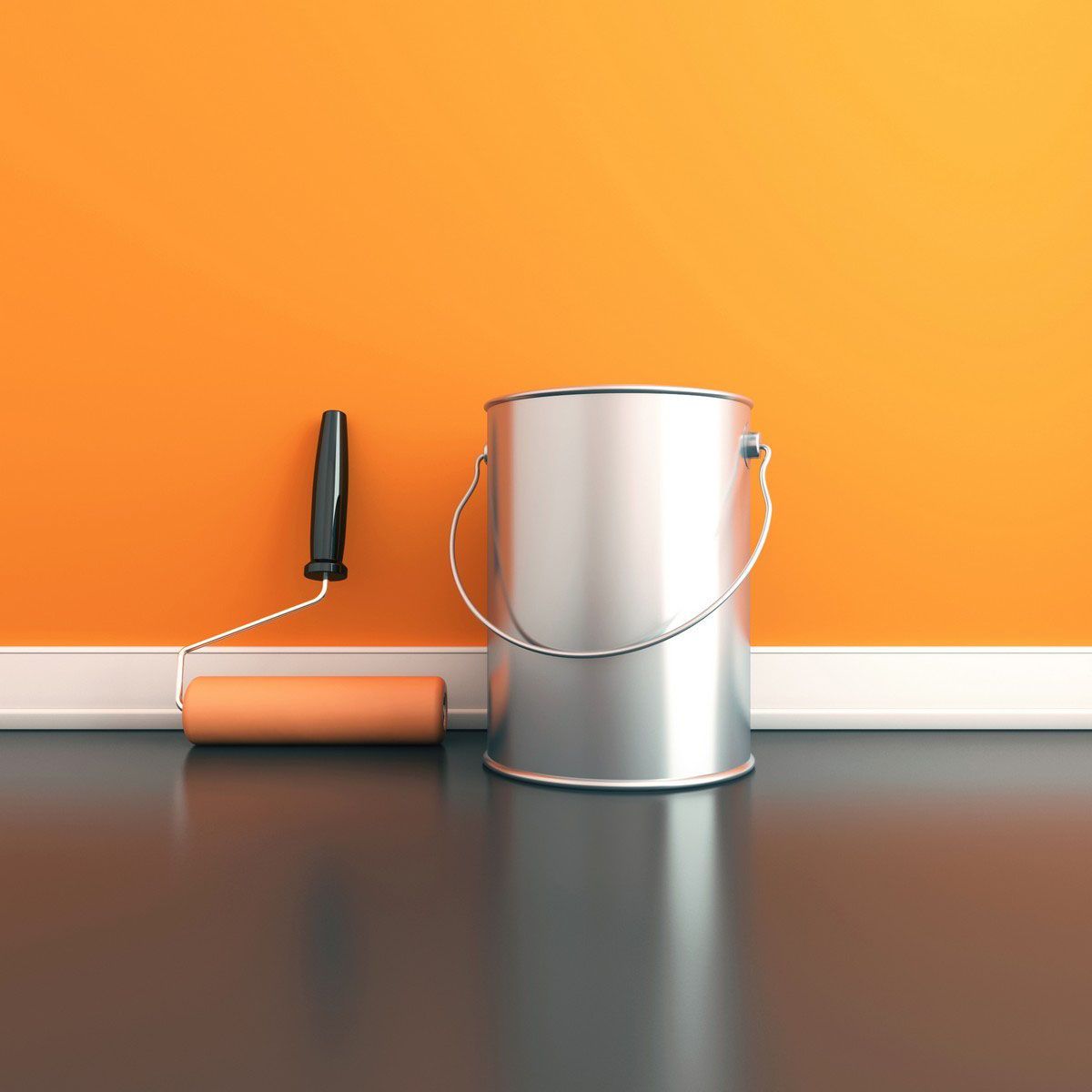
Some rooms are meant to feel active, social, and full of movement. Warm colors such as red, orange, coral, and yellow can create energy and excitement. These shades are often used in dining rooms, kitchens, entryways, creative studios, and accent areas. Red can feel bold and passionate, orange can feel friendly and upbeat, and yellow can feel cheerful when used carefully. These colors tend to draw attention, which makes them useful for spaces where people gather.
Moderation is key. Too much intense color can feel overwhelming, especially in small or dim rooms. A warm accent wall, painted built-ins, or a colorful front door may create the desired energy without taking over the space. Softer versions of energetic colors can also work well. A buttery yellow may feel inviting, while a neon yellow may feel harsh. Professional painting services can help homeowners balance bold choices with each room’s size, lighting, and purpose.
Choosing Colors That Create Focus
Paint color can influence concentration. Home offices, study areas, and homework spaces often benefit from colors that feel clear and steady. Many people prefer soft greens, slate blues, muted charcoals, warm whites, or earthy taupes for these areas. These shades can reduce visual distraction while giving the room personality. A focused space need not feel plain, but it should support the work that happens there.
Different tasks call for different moods. A creative workspace may benefit from a lively accent color that sparks ideas, while a quiet office may need a more subdued palette. Darker colors can create a grounded, library-like atmosphere, but they may need good lighting to avoid feeling heavy. Lighter colors can keep the room open and bright, but overly stark white may feel cold. The best choice depends on how the space is used.
Choosing Colors That Create Comfort
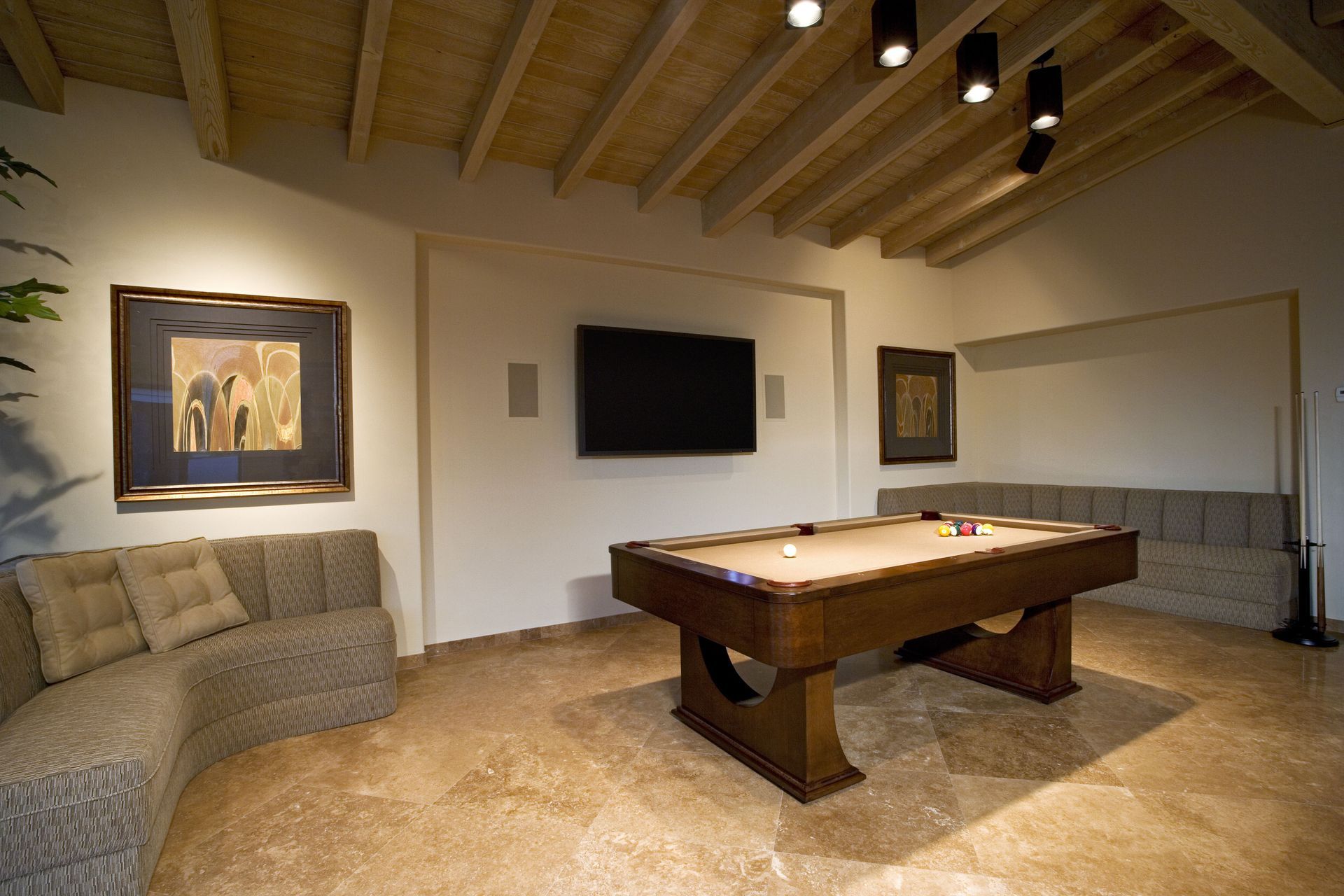
Comforting colors make a home feel warm, personal, and lived in. Cream, beige, terracotta, clay, mocha, olive, and warm white can create a cozy atmosphere without feeling too dark. These colors often work well in living rooms, family rooms, hallways, and bedrooms. They provide a gentle backdrop for furniture, artwork, and natural materials. Warm neutrals are especially popular because they feel timeless while still adding softness.
Comfort can also come from contrast. A room with warm walls, rich wood tones, layered textiles, and soft lighting may feel inviting because all the elements work together. On the other hand, a color that looks warm on a sample card may appear dull if the room does not receive much light. Testing paint on several walls is important because shadows, window direction, and artificial lighting can change how comfortable a color feels. Professional painting services can help homeowners evaluate these factors and choose colors that create the desired atmosphere.
Choosing Colors That Create Spaciousness
Color can change how large or small a room appears. Light colors often reflect more light, which can make a space feel open and airy. Whites, pale grays, soft creams, and light pastels are common choices for smaller rooms, narrow hallways, and spaces with low ceilings. These shades help the eye move around the room more easily. They also provide flexibility when decorating because they pair well with many furniture styles and accent colors.
That does not mean small rooms must always be painted light. Sometimes a deeper color can make a small space feel intentional, stylish, and cozy rather than cramped. Powder rooms, dens, and bedrooms can handle richer colors when the design supports them. The ceiling color, trim color, and finish also matter. A slightly lighter ceiling may make the walls feel taller, while matching trim and wall colors can create a seamless effect. Skilled painting services can help make these details look polished.
Choosing Colors That Create Harmony
A whole-home color plan should feel connected from room to room. Harmony does not require every wall to be the same color. Instead, it means the colors share a relationship. For example, a home may use warm neutrals throughout, with deeper earth tones in select rooms. Another home may use cool whites and soft blues for a fresh feeling. Consistent undertones help the home feel intentional rather than disjointed.
Harmony is especially important in open floor plans, where several rooms are visible. A color that looks beautiful alone may clash with nearby cabinetry, flooring, or stone. Trim, doors, ceilings, and exterior views can also affect the palette. According to Workyard, small local painting companies with fewer than 12 employees account for 88% of the industry’s total revenue. That local experience can be helpful because many small teams understand regional home styles, lighting patterns, and common design preferences.
Choosing Colors That Reflect Personality
Color psychology offers guidance, but your personal reaction matters most. A shade that feels peaceful to one person may feel dull to another. A bold color that seems overwhelming in theory may feel joyful in the right home. Memories, culture, travel, favorite places, and individual taste all shape how people respond to color. The best paint choices support both the function of the room and the personality of the people who live there.
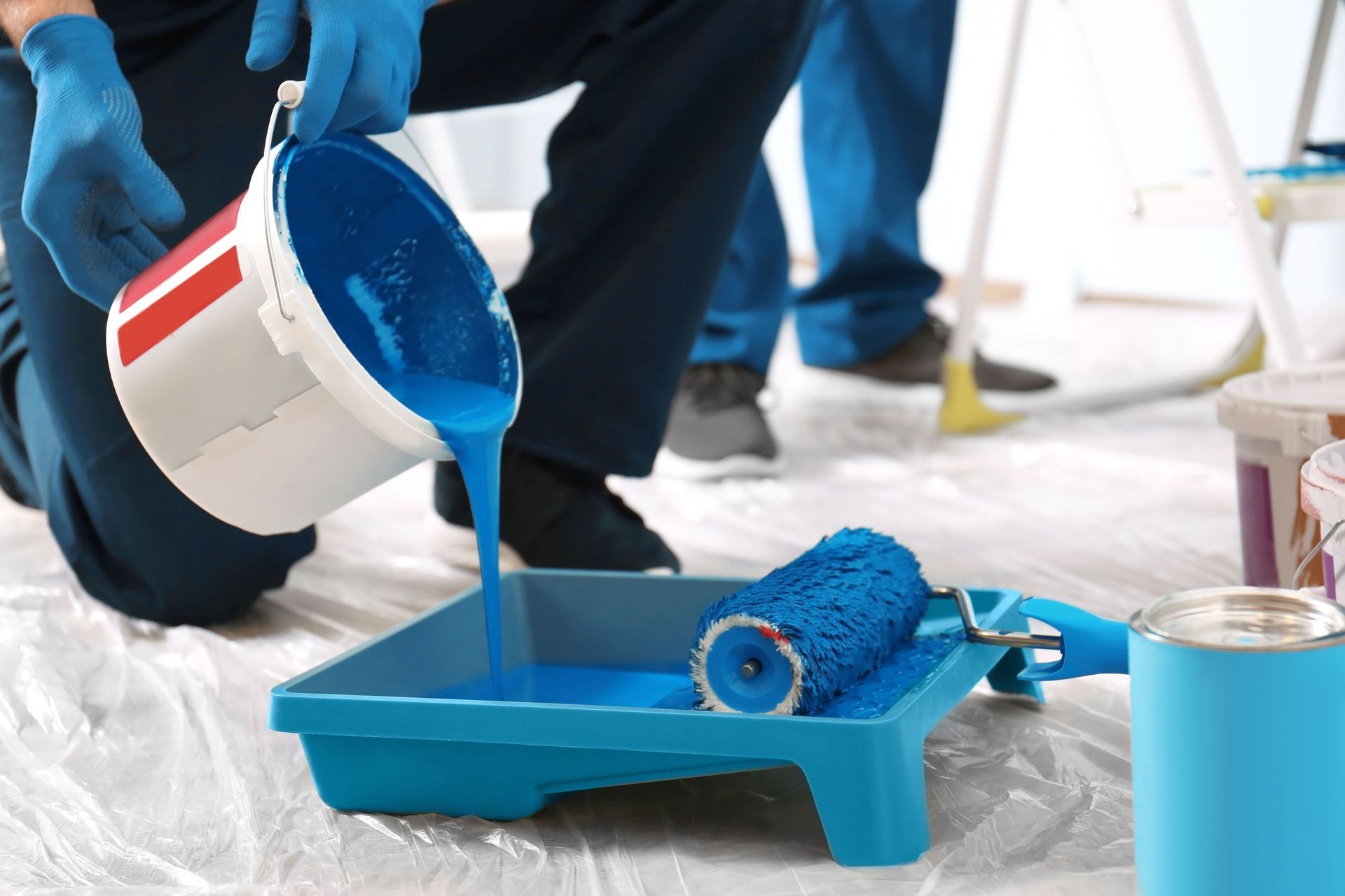
This is where sample testing becomes essential. Paint can look very different on a wall than it does online or in a fan deck. Before committing, it helps to view samples beside flooring, furniture, countertops, and trim. Check them throughout the day as natural and artificial light changes. Experienced painting services can guide the preparation, finish selection, and application process so the final color looks clean, even, and true to the intended mood.
Paint colors have the power to influence how a home feels every day. Calm shades can encourage rest, warm tones can increase energy, focused palettes can support productivity, and harmonious color plans can make the entire home feel more complete. The psychology of color is not about following strict rules, but about choosing shades that fit the room, the light, and the people using the space. With thoughtful painting services, ordinary rooms can become spaces that feel more comfortable, expressive, and functional. If you are ready to use color to change the mood of your home, contact Da-Vinci Painting & Construction.